There are restaurants in Texas with better food than Emmer & Rye. There are restaurants with larger budgets, more press, more square footage, and more Instagram followers. But there are very few restaurants in Texas with a more coherent brand — and coherence, not loudness, is what builds the kind of loyalty that fills a dining room on a Tuesday in February.
Emmer & Rye opened in Austin in 2015 with a premise built on whole-grain milling, whole-animal butchery, and a dim sum-style service format for small plates. The food is the reason people go the first time. The brand is the reason they go back — and the reason they tell other people about it in terms that go beyond the menu.
This post deconstructs what makes their brand work at a physical level: the logo, the palette, the menu as an object, and the way the brand extends from print into the space itself. Then it translates each lesson for restaurant operators in Gillespie County, Comal County, and the wider Texas Hill Country market — because the logic of brand coherence scales down to any budget and any size.
"Emmer & Rye is not a national chain with a brand agency budget. It is an independent Austin restaurant that made intentional brand decisions from day one and has been compounding that identity for nearly a decade. That is exactly the trajectory available to a boutique property in Fredericksburg or New Braunfels."
The Logo and Wordmark: What Restraint Communicates
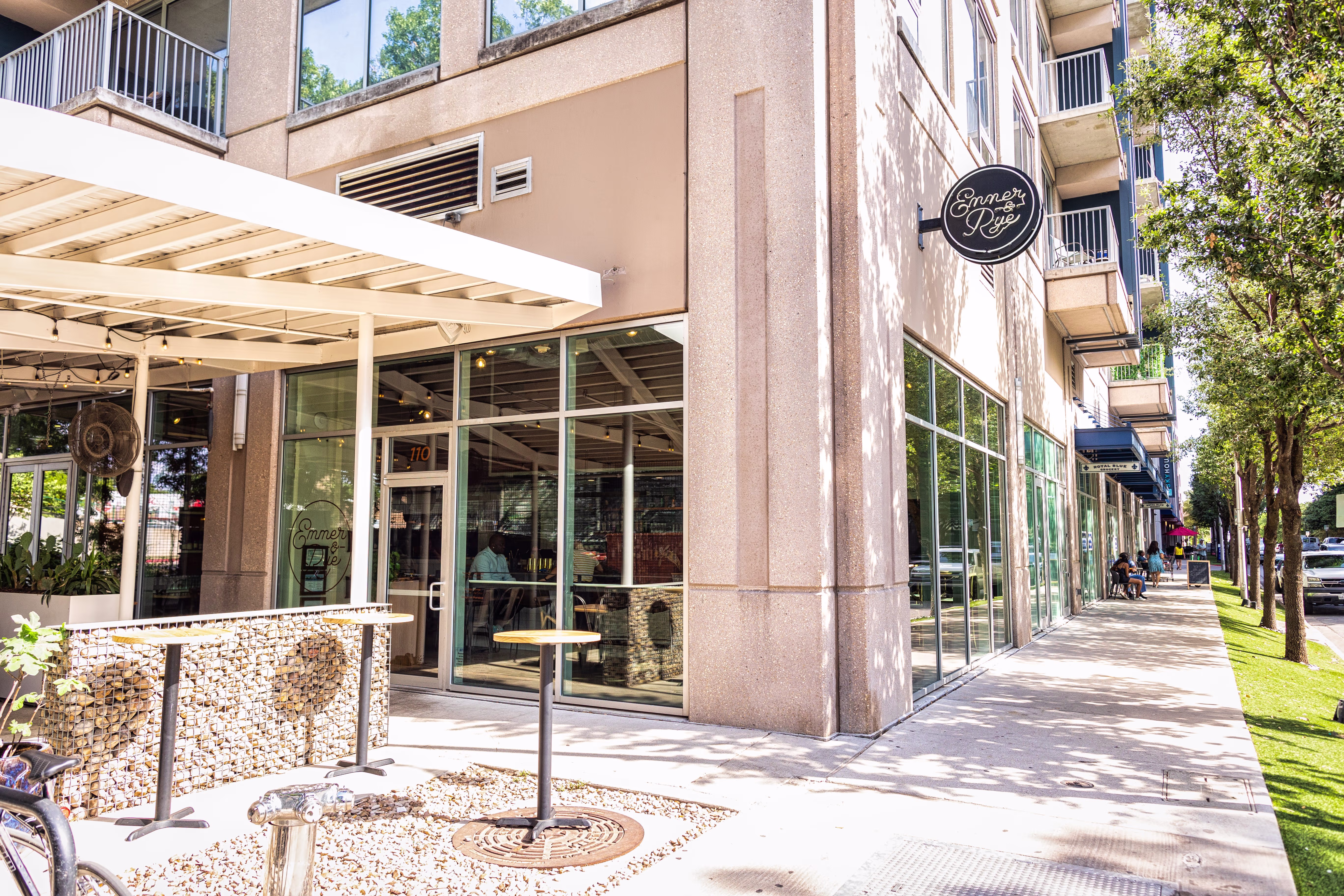
The Emmer & Rye wordmark is a refined serif set in lowercase — no icon, no symbol mark, no wheat shaft or grain illustration. At most touchpoints — the menu cover, the website, the sign on the building — it is simply the name, set with care, in a typeface that communicates age and specificity without trying to explain itself.
This is a harder choice than it looks. Most restaurant logos try to tell a story through illustration — a rolling pin, a fork, a mountain range, a longhorn. The impulse comes from a real place: owners want guests to understand the concept before they walk through the door. But the outcome is almost always a logo that works against the brand instead of for it. Illustration-heavy logos communicate effort rather than confidence. They explain what a strong wordmark would simply embody.
The lowercase setting creates warmth without being casual. The serif conveys age and craft without being stiff. The absence of an icon says: the name is enough. That confidence is the first thing a guest reads before they sit down.
For Gillespie County restaurant owners: if your current logo is explaining your concept through illustration — a vine, a cut of beef, a mason jar — ask whether that explanation is necessary. If the name and typeface are strong, the illustration is noise.
The lesson for boutique restaurants in the Texas Hill Country is specific: choose one typeface. Not a typeface family with twelve weights — one typeface, used with discipline. Set your name in it. Use that same typeface on your menu, your signage, your staff collateral, and your social content. That single decision will do more for brand coherence than any other investment you make.
Color as Atmosphere: How Their Palette Works Without Being Named
Emmer & Rye's color palette is not a design palette — it is an architectural palette. The warm neutrals, aged wood tones, and oxidized metal that appear in their physical space are the same values that inform their print materials, their social photography, and their website. The brand doesn't apply color to the environment. The environment is the brand.
This is a distinction that most restaurant operators in Comal County and Bell County miss because they build it in the wrong order. They design a logo and choose brand colors first, then build or outfit the space — and the two end up fighting each other. The brand palette says warm terracotta; the tile vendor has something that's close enough. The brand guidelines say aged brass hardware; the contractor installs brushed nickel because it was in stock. Each individual compromise is small. The cumulative effect is a space that feels like it almost has a coherent identity.
Emmer & Rye's colors are not trend-driven. They are grounded in the physicality of the ingredients (grain, bone, oxidized metal, worn wood) and the architecture of the space. The palette didn't lead the design — it emerged from it.
For Gillespie County and Comal County operators: if your property is rooted in the Hill Country landscape, your brand palette should come from what's actually there. Cedar bark. Caliche road dust. Hill Country sky in July. Limestone at noon. These are not generic brand decisions — they are local ones. And local specificity is what differentiates a boutique Hill Country concept from a chain.
The Menu as Brand Object: Paper, Typography, Hierarchy
The Emmer & Rye menu is not a list of food and prices. It is an object that carries the brand into the hands of every guest who sits down. The paper weight has presence — it communicates that something intentional is happening before a word is read. The typeface matches the wordmark. The section headers use a visual hierarchy that guides the eye without being bossy about it. The pricing is formatted to keep the guest in the experience rather than anchoring them in transaction mode.
Most restaurants in Texas Hill Country treat the menu as a formatting project. They open a Word document or a Canva template, type in the items and prices, choose a font that's close enough, and send it to a print shop. The result is a menu that works logistically and fails as a brand object entirely.
Here is what the Emmer & Rye menu communicates by the decisions embedded in it:
- Paper weight: care was taken. This is not a disposable document.
- Typeface matching the wordmark: this restaurant has a design system, not just a logo.
- Section header language: this kitchen has a point of view about food, not just categories of it.
- Pricing format: you are here to eat, not to calculate.
Each of these is a brand decision available to a restaurant in Fredericksburg or Johnson City at any budget level. Paper weight costs the same whether the font is on-brand or off. The decision to match typefaces is free. The decision to name your sections with specificity — "From the Fire" instead of "Entrees" — costs nothing and communicates everything.
The Physical Brand in the Space: From the Host Stand to the Plates
Walk through an Emmer & Rye service and catalogue the objects. The host stand material. The ceramic weight in your hand. The glassware. The apron worn by the person who brought your plate. None of this is accidental — and none of it is expensive for its own sake. What it is, is considered. Every object was chosen against a standard, not assembled from whatever was available in the restaurant supply catalog.
For boutique restaurant operators in Gillespie County, this is the most actionable insight in Emmer & Rye's brand story: it is not about budget, it is about having a standard and applying it. The standard is your brand. And applying it means asking, for every object that enters the space: does this belong to the same world as everything else we've built?
Most objects in a restaurant space arrived through convenience, habit, or supply chain availability. That's not a failing — it's a starting point. The work is identifying which objects are working against your brand and replacing them intentionally, one at a time, in priority order.
The highest-impact objects to replace first: the menus, the staff aprons, the in-table or on-table collateral (wine list, QR code card, tent card). These are touched by every guest. They are your smallest and most intimate brand touchpoints.
What Gillespie County and Comal County Operators Can Take From This
Emmer & Rye has Austin press relationships, an experienced ownership group, and a decade of brand equity built through consistent execution. You don't need any of that to apply their logic at your scale. The principles that make their brand work are not expensive. They are disciplined.
On the menu, the sign, the welcome letter, the social post caption graphics, the staff badge. Not a family of fonts — one typeface, applied with discipline. This single decision will make your brand feel more coherent than most restaurants operating in Gillespie County or Comal County today.
The colors of the Hill Country — cedar, limestone, caliche, sky, wildflower gold — are more specific and more defensible than anything a trend-driven palette can offer. Name those colors after the land they came from. Use them across every physical surface and print material. The result is a brand that feels like it could only exist here.
Paper weight, typeface, section header language, pricing format — each is a brand decision. The menu is the most-handled brand object in your building. For a restaurant in Fredericksburg or New Braunfels competing for guests who have driven two hours for the experience, a menu that communicates care and specificity before a dish arrives is a meaningful competitive advantage.
The gap between Emmer & Rye's brand coherence and the average Hill Country restaurant is not a budget gap. It is a decision gap. The decisions were made early, consistently, and with a clear standard. That standard is available to any operator willing to build it.
The Imprint Package — Meridian Studio's entry-level brand build — delivers exactly this foundation: logo, typeface, palette, voice guidelines, and the physical application spec that makes consistency possible across every vendor and every touchpoint. Discovery call is free.