Most restaurants are named for their owners, their neighborhoods, or their primary ingredient. Nixta Taqueria was named for a process — nixtamalization, the ancient Mesoamerican technique of treating corn with an alkaline solution to unlock its nutritional potential and transform its flavor. That decision, made before a single logo was sketched, is the clearest signal of what makes Nixta's brand work: every element begins with the concept, not with convention.
Nixta opened in East Austin in 2021 and quickly built one of the most visually recognized independent restaurant brands in the city. The press followed the brand before the lines did — because a restaurant with a specific, coherent visual identity signals to critics and food writers that there is a point of view worth covering. That signal is available to any boutique restaurant in Gillespie County or Comal County willing to build the identity first and assume the audience will find it.
This post breaks down what makes Nixta's brand work and translates each lesson for the Texas Hill Country market specifically.
"Nixta didn't build their brand with an Austin press budget or a national PR firm. They built it with a clear concept, a name that meant something specific, and a visual identity executed with consistency. That is exactly the formula available to a restaurant opening near Fredericksburg or New Braunfels."
The Name as Brand: Before the Logo, There's the Word
Nixta is a compression of nixtamal — and that compression is itself a design decision. The word is short, pronounceable, and unfamiliar enough to create curiosity without being alienating. It communicates process, heritage, and specificity in a single syllable. Before a guest has seen the logo, visited the space, or tasted the food, the name has already told them something true about what this restaurant believes.
Most Texas restaurant owners name their concept for personal reasons — family names, street names, a word they like the sound of. These names are not wrong, but they are not doing brand work from day one. They are placeholders waiting for the brand to be built around them. Nixta's name is the brand — it encodes the concept before the visual identity does anything.
Consider the difference between these naming approaches for a Hill Country restaurant:
The test for a name doing brand work: can a potential guest infer something true about the concept from the name alone — before seeing the logo, the menu, or the space? If the answer is no, the name is a placeholder. If the answer is yes, the name is the first touchpoint of the brand.
For restaurant operators in Gillespie County and Comal County: the Hill Country has some of the most specific, most ownable naming material available anywhere in Texas. The geology, the agriculture, the water, the light — these are not generic. A restaurant name that comes from this specificity is impossible to replicate in Houston or Dallas. That's a competitive advantage that costs nothing to use.
The Visual Identity: Specificity Over Safety
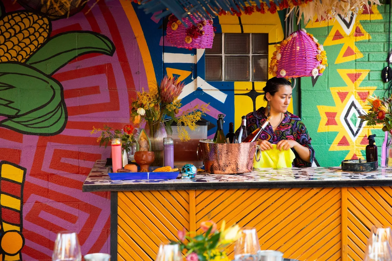
Nixta's visual identity is bold in a way that most Texas restaurant owners would consider risky. The typography is distinctive and culturally specific — it does not look like a generic Austin restaurant, a generic Texas restaurant, or a generic taqueria. The color palette uses warm terracotta, deep sage, and aged cream — colors that reference heirloom corn, the agricultural land it comes from, and the traditional cooking vessels it's prepared in. Every element has a reason that traces back to the concept.
The display typeface in Nixta's identity doesn't look like the default choices available in Canva or the standard restaurant design templates. It was chosen because it carries cultural weight and visual specificity. A guest seeing it on a taco bag or a social post recognizes it as Nixta before reading the name — which is the definition of a brand mark working correctly.
For Hill Country operators: the typeface on your sign, your menu, and your social content is a brand decision that most operators default to the safest available option. Safety is not a brand. Specificity is.
Nixta's palette is not trend-driven. It doesn't use the muted sage-and-terracotta combination because those colors were fashionable in 2021 — it uses them because they are the literal colors of heirloom corn, the clay pots it's cooked in, and the dried chile peppers that season it. The palette has a reason. That reason makes it defensible and specific.
For restaurants in Gillespie County and Comal County: the Hill Country has its own palette — limestone white, cedar bark brown, caliche road dust, bluebonnet purple, live oak grey-green. A brand palette built from the land you're on is more specific, more ownable, and more meaningful to guests who drove to be in that landscape than any trend-based color selection.
How Their Brand Lives in the Physical Space
A Nixta taco, taken to-go, arrives in packaging that is a brand object. The bag, the wrapper, the folded container — each carries the visual identity forward. When a guest photographs their food and posts it to Instagram, they are posting Nixta's brand. This is not accidental. It is the result of treating every physical object the brand touches as a brand extension rather than a logistics solution.
The menu at Nixta reads as a continuation of the visual language established in the identity — not as a separately designed document that happens to share the name. The social content is shot in a way that carries the warm, earthy palette into the visual feed. The space itself — the colors on the walls, the materials at the counter — extends the brand's reference points into the physical environment.
The average Hill Country restaurant has a brand that lives in one place: the sign on the building. The menu was designed separately, the packaging was sourced from a restaurant supply catalog, the social content is shot with whatever light was available. Each of these is a missed brand moment. Each one is an opportunity Nixta did not miss.
"Hold any object from your restaurant — a menu, a to-go bag, a napkin, a receipt. Remove the logo. Would a regular guest know it was yours? If the answer is no, the brand lives only in the logo and nowhere else."
The Lesson for Gillespie County and Comal County Operators
Nixta has advantages that most Hill Country restaurant operators don't — Austin's food media ecosystem, a dense urban market within walking distance, a well-funded opening. None of these are the reason their brand works. Their brand works because of decisions made before opening: a name that encodes the concept, a visual identity that is specific rather than safe, and a commitment to carrying that identity into every physical object the restaurant produces.
All three of those decisions are available to a restaurant opening near Fredericksburg, New Braunfels, or anywhere in the Texas Hill Country — and the Hill Country market has something Nixta's East Austin location doesn't: geographic and landscape specificity that is genuinely unique and genuinely compelling to the guests who seek it out.
The Hill Country has the most ownable naming material in Texas: specific geology, specific agriculture, specific light and water. A restaurant name that comes from this specificity — from the caliche, the cedar, the Pedernales, the Perdernales Valley — is impossible to replicate in a strip mall in Dallas. That's a competitive advantage that costs nothing to use and compounds over years of brand-building.
Nixta's visual identity works because it comes from a specific cultural reference — the heirloom corn tradition, the agricultural land, the craft of nixtamalization itself. For a restaurant in Gillespie County or Comal County, the visual anchors are equally specific: limestone quarrying, German Hill Country farming heritage, the live oak and cedar ecosystem, the Pedernales riverbed. These are not generic. They are yours. Use them.
The highest-ROI brand investment for most Hill Country restaurants is not a new sign — it is applying the existing brand identity to the objects guests handle and photograph. Menus, packaging, to-go containers, napkin bands, sauce label design. Each of these is a social post waiting to happen. Each one is a guest's photograph that becomes unpaid brand content if the object is beautiful and specific enough to be worth shooting.
The gap between Nixta's brand presence and most Texas Hill Country restaurants is not a budget gap, a press gap, or a market gap. It is a decision gap — and the decisions that matter most were made before the restaurant opened, at a cost of time rather than money. That window is available to every operator who is willing to use it.
Meridian's Imprint Package is designed for exactly this stage — the pre-opening or early-operation moment when the naming, visual identity, and brand foundation decisions are still being made. Naming guidance is available as an add-on. Discovery call is free.